
Laura Ashley Blue Litton 10M Wallpaper
- Evoking the essence of a blooming garden, Litton is a beautiful print in an arts and crafts style featuring a delicate arrangement of soft flowers intertwined with scrolling leaves.
- The design match is Straight and the pattern is repeated every 52cm.
- Pattern Repeat 100cm
£48

Laura Ashley Blue Marlbrook 10M Wallpaper
- Inspired by an antique textile sample in the Laura Ashley archive, the Marlbrook print features curving stems blooming with exotic flowers. This statement design adds a sense of sophistication and timeless beauty to any space with its ornamental style.
- The design match is Offset and the pattern is repeated every 59cm.
- Pattern Repeat 100cm
£48
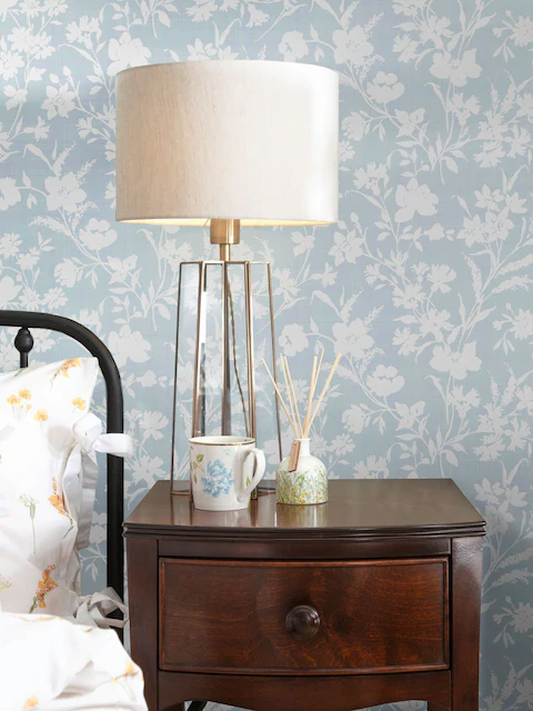
Laura Ashley Blue Rye 10M Wallpaper
- Charismatic and pretty, this striking floral monoprint was inspired by a wallpaper held in the Laura Ashley archive, from 1996. The Rye design incorporates a trailing floral motif, featuring large flowerheads, leaves and stems. The design match is Offset and the pattern is repeated every 53cm.
- Pattern Repeat 100cm
£48

Laura Ashley Blue Yewland 10M Wallpaper
- Illustrating delicate blossoms and graceful vines, Yewland is a delightful floral print capturing the essence of nature s elegance. The design match is Offset and the pattern is repeated every 50.16cm.
- Pattern Repeat 100cm
£48
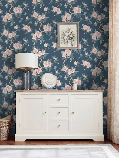
Laura Ashley Blue Maya 10M Wallpaper
- Soft and inviting, Maya is a stunning tonal design featuring stylised oriental blossom branches climbing the print. Held in the Laura Ashley archive, this gorgeous print was previously launched as part of the 2006 Home Furnishings collection.
- The design match is Offset and the pattern is repeated every 63cm.
- Pattern Repeat 100cm
£48
Finding Serenity in Every Shade of Blue – A Personal Journey Through Design, Installation, and Styling
When I first stepped into my 1920s cottage three years ago, I knew the cramped, beige walls needed to breathe with new life. What I didn’t expect was how completely a roll of Laura Ashley’s “Midnight Roses” blue wallpaper would transform not just my dining room, but my entire approach to home design. Since that first installation (which, I admit, involved several YouTube tutorials and a frantic call to my more experienced sister), I’ve become somewhat of a Laura Ashley blue wallpaper enthusiast.
I’m writing this comprehensive guide because I’ve navigated the questions you’re likely asking now—where to buy it, which designs might work in different spaces, installation methods that won’t end in disaster, and how to incorporate these timeless patterns into a modern home. What follows is everything I’ve learned during my three-year love affair with Laura Ashley’s blue wallpaper collection, from practical considerations to the unexpected joy these patterns have brought to my everyday life.
A Brief History: Why Laura Ashley Blue Wallpaper Stands the Test of Time
Before diving into the practical aspects, I think it’s worth understanding why Laura Ashley wallpaper continues to captivate homeowners like me. Laura Ashley founded her textile company in 1953, working from her kitchen table in London. What began as a modest operation printing Victorian-inspired headscarves evolved into one of the most recognizable home furnishing brands in the world.
The brand’s signature style—romantic, English countryside-inspired patterns featuring florals, stripes, and delicate motifs—became synonymous with a certain timeless elegance that transcends passing trends. When it comes to blue wallpaper specifically, Laura Ashley’s designs have historically showcased the versatility of this color: from pale, whisper-soft powder blues that expand small spaces to rich, dramatic navy tones that add depth and sophistication.
I’ve come to appreciate how these wallpapers connect us to design heritage while remaining surprisingly relevant in contemporary homes. There’s something profoundly comforting about surrounding yourself with patterns that have adorned homes for generations—a sense of continuity and craftsmanship that’s increasingly rare in our disposable design culture.
Where to Find Your Perfect Blue Pattern
When I began my search for the perfect Laura Ashley blue wallpaper, I quickly discovered that availability varies depending on your location and whether you’re seeking current or discontinued patterns. The most reliable places to purchase authentic Laura Ashley blue wallpaper are the official Laura Ashley website, authorized retailers like Wayfair and Home Depot, and specialty wallpaper stores that carry the brand.
I’ve purchased from all three sources over the years, and each has its advantages. The official website typically offers the most comprehensive selection of current designs, though shipping times can occasionally run longer than expected. Authorized retailers sometimes offer competitive pricing during sales events—I found my kitchen’s “Bluebells” pattern at 30% off during a Home Depot spring sale.
For those hunting specific discontinued patterns (as I was when searching for the perfect powder blue stripe for my guest bathroom), specialty wallpaper stores sometimes maintain inventory of older collections. I’ve also had success with online marketplaces where unopened rolls occasionally appear, though authentication becomes important in these scenarios.
Regional availability varies significantly, with UK customers generally having access to more extensive selections than North American or Australian customers. If you’re outside the UK, I recommend contacting customer service before setting your heart on a specific pattern you’ve seen online, as some designs may be region-specific or unavailable in your market.
The Spectrum of Blue: Understanding Available Shades and Designs
Laura Ashley’s blue wallpaper collection spans virtually every shade of blue imaginable, each creating dramatically different effects in your space. After experimenting with several variations, I’ve developed a deeper appreciation for how these different blues transform rooms throughout the day as natural light changes.
Pale Blues and Duck Egg
The lightest shades in the collection include pale sky blues and the popular duck egg blue. These delicate hues create an atmosphere of expansive calm and tend to make spaces appear larger. My north-facing home office wears a pale blue damask pattern called “Morning Mist” that counteracts the room’s natural darkness.
Duck egg blue—that perfect blend of blue and green—features prominently in patterns like “Josette” and “Summer Palace,” offering a sophisticated yet soothing backdrop that pairs beautifully with both white woodwork and natural wood tones. These lighter blues work exceptionally well in smaller spaces like powder rooms or bedrooms where you want to create a sense of airiness.
Mid-Tones: Cornflower, French, and Royal Blues
The mid-range blues constitute the largest segment of Laura Ashley’s blue wallpaper offerings. These include vibrant cornflower blues, elegant French blues, and classic royal blues. The “Wisteria” pattern in cornflower blue transformed my hallway from a forgettable transitional space into a garden-inspired focal point.
Mid-tone blues offer tremendous versatility—bold enough to make a statement but not so overwhelming that they dominate a room. I’ve found these shades particularly effective in dining rooms and living areas where you want to create a convivial atmosphere that still feels sophisticated.
Deep Blues: Navy, Indigo, and Midnight
At the darkest end of the spectrum are the navy, indigo, and midnight blues that add dramatic depth to any space. I was initially hesitant to use Laura Ashley’s “Midnight Garden” in my small guest bedroom, fearing it would make the room feel claustrophobic. Instead, this deep blue floral pattern created an unexpectedly cozy, jewel-box effect that guests consistently compliment.
These darker blues work beautifully as accent walls, in rooms with abundant natural light, or in spaces where you want to create a more intimate atmosphere. They pair stunningly with metallic accents like brass or gold, adding a touch of luxury to any room.
Patterns That Tell a Story: Design Categories in Laura Ashley Blue
Beyond shade variations, Laura Ashley’s blue wallpaper comes in distinct pattern categories, each creating different effects in your home. Understanding these broad categories helped me narrow down my selections for different rooms.
Floral Patterns: From Delicate to Dramatic
Laura Ashley built its reputation on floral patterns, and the blue wallpaper collection showcases this heritage beautifully. Options range from delicate, scattered blooms like “Summer Meadow” to bold, statement florals like “Baroque Garden.”
My dining room features the “Midnight Roses” pattern—large-scale blue roses against a slightly lighter blue background—creating a dramatic yet elegant atmosphere perfect for entertaining. For my mother’s bedroom renovation, we selected the more delicate “Forget-Me-Not” pattern, which incorporates tiny blue flowers on a pale background, creating a serene retreat that doesn’t overwhelm her modestly sized room.
Floral patterns work particularly well in bedrooms, dining rooms, and living spaces where you want to introduce an element of natural beauty. The scale of the pattern matters significantly—larger florals create bold statements while smaller patterns read more as texture from a distance.
Geometric and Striped Designs: Timeless Structure
For those who prefer more structured patterns, Laura Ashley offers a range of geometric and striped designs in various blue colorways. The “Cambridge Stripe” in French blue adorns my guest bathroom, adding visual interest without the softness of florals.
Geometric patterns like “Parterre” and “Belvedere” offer architectural interest while maintaining the classic Laura Ashley aesthetic. These designs work particularly well in studies, bathrooms, and spaces where you want to create a sense of order and precision.
I’ve found that striped patterns can visually alter room proportions—vertical stripes heighten low ceilings, while horizontal stripes can visually widen narrow spaces. This dimensional effect makes them particularly useful in challenging architectural situations.
Damask and Traditional Patterns: Elegant Heritage
The damask and traditional pattern category includes some of Laura Ashley’s most timeless designs. These patterns draw inspiration from historical textiles and architectural elements, reimagined in various blue colorways.
My living room features the “Chatsworth” damask in a deep royal blue, creating a backdrop of traditional elegance that surprisingly complements both my vintage and contemporary furniture pieces. These patterns carry a sense of established sophistication that anchors a room in design history.
Traditional patterns work exceptionally well in formal living spaces, master bedrooms, and dining rooms where you want to create a sense of traditional elegance without feeling stuffy or dated.
Toile and Scenic Patterns: Storytelling Through Design
Perhaps the most narrative-driven category is the toile and scenic patterns. These designs typically feature pastoral scenes, architectural vignettes, or nature-inspired tableaux rendered in varying shades of blue against white or cream backgrounds.
The classic “Oriental Garden” toile in indigo decorates my powder room, transporting visitors to an idealized Eastern landscape with pagodas, bridges, and flowering trees. These patterns inject personality and conversation-starting elements into smaller spaces.
Toile patterns work beautifully in dining rooms, libraries, and spaces where you want to create a sense of story and visual interest. They pair particularly well with solid-colored furnishings that don’t compete with their detailed narratives.
Practical Considerations: What You Need to Know Before Purchasing
While aesthetic considerations naturally drive most wallpaper decisions, several practical factors significantly impact your Laura Ashley blue wallpaper experience. Here’s what I’ve learned about the nuts and bolts of selection and installation.
Traditional Paste vs. Peel-and-Stick Options
Most Laura Ashley blue wallpapers come in traditional paste-the-wall or paste-the-paper formats, though in recent years, the brand has introduced some peel-and-stick options in their most popular patterns. As someone who’s installed both types, I can attest that each has distinct advantages.
Traditional paste wallpapers offer superior longevity and a more luxurious finish. My living room’s “Chatsworth” damask, installed three years ago using traditional paste, shows absolutely no signs of seam separation or fading despite being in a high-traffic area with significant sun exposure.
However, I opted for the peel-and-stick version of “Morning Mist” in my home office, knowing I might want to change it as my tastes evolve. The installation was significantly easier, though I noticed the material doesn’t have quite the same textural quality as the paste version. For renters or those who frequently redecorate, peel-and-stick provides valuable flexibility.
Most specialty patterns and heritage designs are only available in traditional paste versions, so if you’ve fallen in love with a specific design, you may not have a choice between installation methods.
Pricing and Budget Considerations
Laura Ashley blue wallpaper represents a premium product, with pricing that reflects its design heritage and quality. Current prices typically range from $50 to $120 per roll, depending on the pattern complexity, material quality, and whether you’re purchasing a current or archived design.
From my experience renovating multiple rooms, I recommend budgeting approximately $350-700 for wallpapering an average bedroom, assuming you’ll need 5-7 rolls. Specialty rooms like powder rooms might require only 2-3 rolls, making them perfect “splurge” spaces if your budget is limited.
Ways I’ve found to save money include:
- Watching for seasonal sales (I’ve seen discounts of up to 40% during end-of-season clearances)
- Using more expensive wallpaper as an accent wall, complemented by painted walls in coordinating colors
- Checking clearance sections for discontinued patterns (which often sell at 50-70% off original pricing)
- Considering open-box returns at specialty retailers (ensuring, of course, that sufficient quantity remains for your project)
Remember to factor in additional costs for primer, paste, and installation tools if you’re DIY-ing, or professional installation costs if you’re hiring help.
Roll Sizes and Coverage
Understanding Laura Ashley’s standard roll dimensions is crucial for accurate ordering. The standard Laura Ashley wallpaper roll covers approximately 56 square feet (5.2 square meters), measuring 20.5 inches wide by 33 feet long (52cm × 10m).
However, this doesn’t translate to 56 square feet of wall coverage due to pattern matching requirements. Depending on the pattern repeat size, actual coverage may be 25-40% less than the raw square footage. My “Midnight Roses” pattern, with its large 25-inch repeat, required almost 30% more paper than a simple stripe would have.
I strongly recommend using Laura Ashley’s wallpaper calculator (available on their website) or consulting with a professional to determine your exact requirements. In my experience, it’s always wise to order one extra roll beyond the calculated need—nothing is more frustrating than running short and discovering your pattern has been discontinued.
Durability and Practical Applications
After living with multiple Laura Ashley blue wallpapers for several years, I can speak to their durability in different environments. Most of their standard wallpapers feature a vinyl coating that provides moderate moisture resistance and washability—perfect for dining rooms, bedrooms, and living spaces.
For moisture-prone areas like bathrooms and kitchens, look specifically for their “washable” or “scrubbable” designations. My kitchen’s “Bluebells” pattern carries the scrubbable rating and has withstood cooking splatters and steam admirably, requiring only occasional wiping with a damp cloth.
Be aware that even water-resistant wallpaper isn’t suitable for direct water contact areas like shower surrounds. In my bathroom renovation, I limited the Laura Ashley “Cambridge Stripe” to walls away from the shower area, using complementary tile in wet zones.
Most Laura Ashley blue wallpapers are rated for 5-10 years of life in normal conditions, though I’ve seen vintage installations that look beautiful after much longer periods when properly maintained and protected from direct sunlight.
Installation Insights: From DIY to Professional Approaches
Having installed Laura Ashley wallpaper both independently and with professional help, I can offer perspective on both approaches.
DIY Installation: Tips for Success
For my first DIY installation—the “Midnight Roses” in my dining room—I spent almost as much time researching techniques as actually hanging the paper. Based on that experience and subsequent projects, here are my key recommendations for successful DIY installation:
- Preparation is everything. Ensure walls are clean, smooth, and primed with a wallpaper-specific primer. I learned this lesson the hard way when skipping primer on one wall led to adhesion problems that required redoing an entire section.
- Invest in quality tools. A sharp utility knife with replacement blades, a proper smoothing brush, a seam roller, and a plumb line or laser level make a significant difference in your results.
- Cut all pieces before beginning to paste. For pattern-heavy designs like “Baroque Garden,” I pre-cut all pieces with appropriate pattern matching allowances before mixing any paste, reducing time pressure during the actual hanging.
- Work with a partner when possible. My most successful installations involved a second person helping to handle the delicate moments of positioning large, paste-covered sheets.
- Follow manufacturer instructions precisely. Laura Ashley provides specific soaking times and paste recommendations for their papers—deviating from these has consistently led to problems in my experience.
For first-time DIYers, I recommend starting with a smaller space like a powder room or accent wall to build confidence before tackling larger projects.
When to Consider Professional Installation
After two successful DIY installations, I still opted for professional help with the “Chatsworth” damask in my living room. The pattern’s complexity, the room’s architectural challenges (including crown molding and multiple doorways), and the expense of the paper itself justified the additional cost.
Consider professional installation when:
- Your pattern has a complex repeat requiring precise matching
- Your space features architectural challenges like sloped ceilings or multiple cutouts
- The wallpaper represents a significant investment you don’t want to risk damaging
- You’re working with especially delicate or specialty papers
- Your time constraints make DIY impractical
In my experience, professional installation costs range from $2-$5 per square foot, varying by region and complexity. Most professionals provide free estimates and can offer valuable advice on pattern selection for challenging spaces.
Styling with Laura Ashley Blue Wallpaper: Creating Cohesive Spaces
Beyond selection and installation, the true art lies in integrating these distinctive patterns into cohesive living spaces. Here’s how I’ve approached styling around my Laura Ashley blue wallpapers.
Coordinating with Furniture and Accessories
The versatility of blue allows for surprisingly diverse furniture pairings. With my “Midnight Roses” dining room, I found that warm wood tones—particularly walnut and cherry—create beautiful contrast against the cool blues. My vintage mahogany dining table visually pops against the deep blue background in a way it never did against the previous neutral walls.
For living spaces with the “Chatsworth” damask, I balanced the traditional pattern with a mix of both antique and contemporary furniture—a Victorian settee alongside a clean-lined modern coffee table creates an interesting tension that prevents the space from feeling like a period room.
Accessories provide another layer of coordination. I’ve found that:
- Brass and gold accents warm up cooler blue tones beautifully
- Introducing small touches of complementary colors (like coral or burnt orange) creates sophisticated color balance
- White ceramics and linens provide visual “breathing space” against busier patterns
- Natural elements like woven baskets and plants help ground traditional patterns in contemporary living
Coordinating with Other Wall Coverings and Paint
Few homes are wallpapered throughout, making thoughtful transitions between wallpapered and painted spaces essential. When selecting paint colors for adjacent rooms to my “Wisteria” hallway, I pulled the lightest blue tone from the wallpaper for my living room, creating subtle continuity without matching exactly.
For rooms with accent walls, I’ve found that choosing a paint color one or two shades lighter than the background color of the wallpaper creates a harmonious extension of the design. My bedroom features the “Forget-Me-Not” pattern on one wall, with remaining walls painted in a pale blue-gray pulled directly from the paper’s background.
When transitioning between different wallpapers (as between my blue-patterned hallway and dining room), I ensured they shared at least one shade in their respective color palettes, creating a throughline that makes the progression feel intentional rather than disjointed.
Creating Matching Textile Programs
One of Laura Ashley’s strengths is their coordinated textile programs, with many blue wallpaper patterns available in matching or complementary fabrics. I utilized this advantage in my guest bedroom, where curtains in the same “Midnight Garden” pattern as the wallpaper create a cocooning effect.
For a more subtle approach, my living room features cushions in a smaller-scale version of the “Chatsworth” damask used on the walls, creating rhythm without overwhelming match-matchy coordination.
Even when exact matches aren’t available or desired, the Laura Ashley fabric collection includes numerous blue textiles designed to coordinate with their wallpapers. I’ve found their textile sample service invaluable for testing combinations before committing to expensive yardage.
Maintaining Your Blue Wallpaper’s Beauty: Care and Longevity
Proper maintenance significantly extends the life of your investment in Laura Ashley blue wallpaper. After several years of living with various patterns, I’ve developed effective care routines.
Cleaning and Day-to-Day Care
For routine dust removal, a microfiber duster or the soft brush attachment on your vacuum works perfectly. I make this part of my weekly cleaning routine to prevent dust buildup in the textured surfaces of patterns like “Baroque Garden.”
For washable and scrubbable varieties, occasional cleaning with a slightly damp cloth removes fingerprints and light marks. I’ve found that a solution of mild dish soap and water works well for more stubborn spots, though always test in an inconspicuous area first.
Avoid abrasive cleaners, which can damage the surface printing, and never scrub vigorously even on “scrubbable” papers. For my kitchen installation, gentle wiping rather than scrubbing has preserved the vibrant blues without wearing away the surface.
Protecting from Environmental Damage
Sunlight represents the greatest threat to the longevity of blue wallpapers, potentially causing fading over time. In my south-facing dining room, I installed UV-filtering window films that allow light while protecting the “Midnight Roses” from color degradation.
Humidity fluctuations can also affect wallpaper adhesion over time. I maintain relatively stable humidity levels (between 40-60%) using a combination of dehumidifiers in summer and humidifiers in winter, which protects not just the wallpaper but all wood furnishings as well.
For particularly valuable or irreplaceable vintage Laura Ashley papers, consider professional application of a clear, protective topcoat designed for wallpaper. This added layer of protection is particularly valuable in high-traffic areas or homes with young children.
Repairing Minor Damage
Despite best efforts, occasional damage occurs. I’ve successfully addressed several minor issues:
- For small tears, wallpaper seam adhesive carefully applied with a small artist’s brush can reattach separated sections
- For stained areas that won’t clean, carefully matched acrylic paint applied with a fine brush can camouflage the damage
- For lifting seams, a small application of wallpaper paste and gentle pressure usually resolves the issue
Keep leftover wallpaper for potential patch repairs, storing it flat in a cool, dry place wrapped in acid-free tissue paper to maintain color fidelity.
The Environmental Question: Sustainability Considerations
As environmental awareness grows, many homeowners question the sustainability of their design choices. Laura Ashley has made strides in addressing these concerns with their blue wallpaper collection.
Many of their newer wallpapers feature FSC-certified paper sourced from responsibly managed forests, though this varies by collection. Their manufacturing processes increasingly comply with European environmental standards, with reduced VOC emissions compared to historical production methods.
For the most eco-conscious options within the blue wallpaper range, look specifically for:
- Water-based ink formulations (now used in most of their printing)
- FSC certification labeling on packaging
- PVC-free options (available in select designs)
I’ve found that the brand’s durability contributes significantly to its sustainability profile—a quality wallpaper that lasts 10+ years represents a more responsible choice than frequently replaced, cheaper alternatives, even if the initial environmental footprint is higher.
Finding Special Deals and Discontinued Patterns
For budget-conscious decorators or those seeking specific vintage patterns, strategic shopping can yield significant rewards.
Navigating Sales and Clearance Events
Laura Ashley typically runs several major sales annually, with Boxing Day (December 26th) and end-of-summer clearances offering the deepest discounts. I purchased my “Bluebells” kitchen wallpaper during their annual summer sale at 35% off regular pricing.
Signing up for their email newsletter provides advance notice of upcoming sales—I’ve occasionally received subscriber-exclusive discount codes offering an additional percentage off already-reduced prices.
For U.S. customers, retail partners like Wayfair and Home Depot often include Laura Ashley wallpapers in their site-wide sale events, sometimes with deeper discounts than the official site offers.
Sourcing Discontinued Patterns
Finding discontinued Laura Ashley blue wallpapers requires more detective work but can yield unique designs at reduced prices. My sources include:
- Specialty wallpaper shops that maintain backstock of discontinued patterns
- Online marketplaces where sellers occasionally list unused vintage rolls
- Estate sales in areas with historic homes, where unused rolls are sometimes discovered during cleanouts
- Wallpaper outlet stores that purchase end-of-line stock from manufacturers
When purchasing vintage or discontinued patterns, always verify the roll quantity before beginning your project, as finding additional matching rolls later may prove impossible.
Creating Feature Walls vs. Whole-Room Applications
The question of whether to paper an entire room or create a feature wall depends on both aesthetic preference and practical considerations.
The Impact of Feature Walls
Feature walls allow you to incorporate bold patterns without overwhelming a space. My home office uses the “Morning Mist” pattern on the wall behind my desk, creating a focal point while keeping the remaining walls a complementary pale blue paint.
This approach works particularly well:
- In smaller rooms where full wallpaper might feel claustrophobic
- With large-scale or dramatic patterns that might overwhelm when used throughout
- When budgetary constraints make full-room wallpapering impractical
- In rental properties where you want to minimize removal efforts later
The key to successful feature walls lies in choosing which wall to highlight. I’ve found that the natural focal wall—typically the one you see upon entering or where architectural features already draw attention—usually works best.
Embracing Full-Room Designs
For certain patterns and spaces, whole-room application creates a magical, immersive effect. My guest bedroom’s full coverage in “Midnight Garden” transformed a basic box into a jewel-like retreat that guests frequently photograph and comment upon.
Full-room wallpaper works beautifully:
- With smaller-scale patterns that read as texture from a distance
- In dining rooms and bedrooms where a cocooning effect enhances the room’s function
- When the pattern incorporates sufficient negative space to avoid visual overwhelm
- In rooms with architectural interest that wallpaper can highlight rather than compete with
I’ve discovered that rooms fully papered in Laura Ashley blue patterns often photograph beautifully, creating memorable spaces that become the heart of your home’s identity.
The Final Assessment: Is Laura Ashley Blue Wallpaper Right for You?
After three years and multiple rooms adorned with various Laura Ashley blue wallpapers, I can confidently say these designs have transformed my relationship with my home. Where once I had a pleasant but unmemorable house, I now have distinctive spaces that reflect both timeless design heritage and my personal aesthetic.
For those considering this investment, I offer these concluding thoughts:
Laura Ashley blue wallpaper represents an investment in design quality and longevity that transcends trends. Unlike more temporary decorating choices, these papers establish a foundation of timeless elegance that adapts beautifully to evolving furnishings and accessories.
The spectrum of blues available—from whisper-soft duck egg to dramatic midnight navy—offers solutions for virtually any lighting condition, room function, or design objective. Whether creating serene retreats or dramatic entertaining spaces, the collection provides options that elevate ordinary rooms to extraordinary experiences.
While not the least expensive wallpaper option available, the quality, design integrity, and longevity of Laura Ashley blue wallpapers create genuine value over time. My earliest installation, now three years old, looks as vibrant and beautiful as the day it was hung—a testament to the quality of materials and timelessness of design.
As someone who once viewed wallpaper as a daunting commitment, I’ve discovered that these blue patterns have become not just backdrops but characters in my home’s story—elements that both ground spaces in design history and push them toward fresh, personal expression.
Whether you choose a single accent wall or a full-room installation, Laura Ashley’s blue wallpaper collection offers that rare combination of heritage and innovation, tradition and freshness, that defines truly timeless interior design.