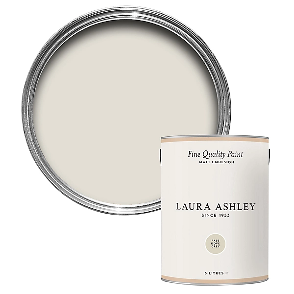
Laura Ashley Pale Dove Grey Matt Emulsion paint, 5L
- This high quality water based paint with a sophisticated soft matt finish is the perfect choice to update your interior walls & ceilings.
- Guarantee – Statutory
- Suitable for use on Wall & ceilings
- Surface Preparation – Surfaces to be painted must be clean, dry and free from grease, dust and dirt. Old oil based surfaces should first be sanded to provide a key and then primed using a quality water based primer. (N.B. Avoid the inhalation of dust. Wear a suitable dust mask if dry sanding and take special precautions when sanding pre-1960’s oil based paint surfaces as they may contain harmful lead). Surface priming with a quality water based primer is generally recommended where there is doubt about the surface to be painted with Laura Ashley Water Based Eggshell. Greasy or dirty surfaces should first be washed using a mild detergent or sugar soap and allowed to dry thoroughly.
- Instructions for Use – Stir thoroughly before use. Suitable for brush or roller application to internal surfaces such as plaster and stone. For roller application can be diluted with up to 10% water. If more than one can of the same colour is used, ensure the batch numbers are the same or intermix well before use. Two full coats of matt emulsion should be applied to achieve the required colour standard.
- Instructions for Storage – Store in a cool, well ventilated area. Keep container tightly closed.
£78
Discovering the Perfect Neutral for Modern Living
As I stand in my newly painted living room, watching how the soft grey walls catch the morning light, I can’t help but marvel at how one simple color decision has completely transformed my home. After weeks of deliberation and countless paint samples, Laura Ashley Dove Grey paint has proven to be the most versatile and elegant neutral I’ve ever used – and I’m excited to share everything I’ve learned about this remarkable shade.
When I first considered repainting, I was overwhelmed by the sheer number of grey options available. Too cool, too warm, too dark, too light – finding the perfect balance seemed impossible until I discovered Laura Ashley’s Dove Grey. This comprehensive guide will walk you through everything you need to know about this sophisticated shade, from where to purchase it to how it performs in different lighting conditions.
My Journey with Dove Grey
My fascination with Laura Ashley Dove Grey began when I spotted it in a friend’s recently renovated kitchen. The color had this remarkable quality – present yet subtle, creating a calm backdrop that somehow made everything else in the room look more intentional. I was immediately intrigued, and what started as casual interest quickly evolved into a deep dive into the world of premium paint colors.
Where to Purchase Laura Ashley Dove Grey Paint
Finding Laura Ashley Dove Grey wasn’t as straightforward as I initially expected. Unlike some mainstream brands available at every corner hardware store, Laura Ashley paints have specific distribution channels. I discovered they’re primarily sold through:
- Select home improvement retailers
- Laura Ashley’s official website
- Specialized paint and decor shops
- Some department stores with home sections
During my search, I found that availability varied significantly by location. In my case, I located a specialty paint shop about 30 minutes from my home that carried the full Laura Ashley paint line. The slight inconvenience of traveling to a specific retailer was absolutely worth it for the quality and color accuracy.
For those who prefer online shopping, the official Laura Ashley website offers their complete paint collection with detailed color charts and finish information. However, I strongly recommend seeing this color in person before making a final decision – as with any paint, digital representations can vary significantly from the actual shade.
Available Finishes: Finding the Perfect Sheen
One aspect I particularly appreciated about Laura Ashley Dove Grey is the range of finishes available. This isn’t just one paint, but rather a color available in multiple formulations to suit different needs:
- Matte/Flat: Creates a sophisticated, velvety appearance with minimal light reflection. This is what I chose for my living room walls, as it beautifully conceals minor imperfections and creates a soft, contemporary look.
- Eggshell: Offers a subtle sheen that’s slightly more durable than matte. I selected this for my hallway, striking a perfect balance between elegance and practicality in a high-traffic area.
- Satin: Provides a gentle luster that’s particularly effective in rooms where you want a bit more light reflection without high shine. This worked beautifully in my daughter’s bedroom.
- Semi-gloss: Features a noticeable sheen that’s highly durable and easy to clean. I used this finish for the trim throughout my home, creating a subtle contrast with the matte walls.
- High-gloss: Offers the most reflective finish, creating a mirror-like surface. While I didn’t use this myself, I’ve seen it used effectively on statement furniture pieces.
Each finish dramatically affects how the color presents itself. The same Dove Grey appears slightly darker in a matte finish than in a glossier option due to light reflection differences. This is worth considering when planning your space.
The Investment: Price Considerations
Let’s talk about cost, because Laura Ashley Dove Grey is unquestionably a premium paint product with a price point to match. When I first saw the price tag, I experienced momentary sticker shock – it was approximately 15-30% more expensive than many standard paint brands I’d used previously.
A standard 2.5-liter tin (approximately 2/3 gallon) typically costs between $45-60 depending on the finish and retailer. For specialty finishes or larger containers, expect to pay more. While this initially seemed steep, I’ve come to understand the value proposition:
- Superior pigmentation requiring fewer coats
- Enhanced durability reducing the need for touch-ups
- Premium ingredients that create a more sophisticated finish
- Excellent coverage that often makes one tin go further than expected
For my 14×16-foot living room, I used just under two 2.5-liter tins of the matte finish for two full coats. The coverage was remarkably efficient compared to some less expensive brands I’ve used in the past.
If you’re working with a tight budget, I recommend purchasing just what you need rather than economizing on quality. The difference in appearance and longevity makes Laura Ashley paint worth the investment, particularly for a versatile neutral like Dove Grey that you’ll likely keep for years.
Perfect Rooms for Dove Grey: Creating Harmony Throughout Your Home
After experimenting with Laura Ashley Dove Grey throughout my home, I’ve found it performs differently in various spaces. Its chameleon-like quality is perhaps its greatest strength – adapting beautifully to different rooms and purposes.
Living Rooms and Common Areas
Dove Grey creates an ideal backdrop for living spaces. In my own living room, it provides a sophisticated neutral canvas that allows artwork and furniture to stand out without competing for attention. The color reads as warm in the evening under lamplight, creating a cozy atmosphere for gathering with family and friends.
The color’s depth changes subtly throughout the day, shifting from a lighter, brighter grey in morning sunlight to a deeper, more intimate tone as evening approaches. This dynamic quality keeps the space feeling fresh and interesting regardless of the time of day.
Bedrooms: A Sanctuary of Calm
In bedrooms, Dove Grey creates a serene retreat. I used it in our master bedroom with white trim and was amazed at how instantly calming the space became. The color provides enough visual interest to avoid feeling sterile while remaining sufficiently neutral to work with changing bedding and accessories.
For children’s rooms, it offers a sophisticated alternative to traditional pastel shades. My teenage daughter specifically requested this color for her room redesign, pairing it with vibrant accessories that she can easily change as her tastes evolve.
Kitchens and Dining Spaces
Initially, I was hesitant to use grey in my kitchen, fearing it might feel cold or industrial. However, Dove Grey surprised me with its warmth, especially when paired with wooden elements and brass hardware. The color creates a refined backdrop for culinary activities while concealing the inevitable minor marks and splashes that occur in busy kitchens.
For the dining room, I chose Dove Grey in an eggshell finish, which creates subtle light play during dinner parties. The color feels appropriately formal yet welcoming – the perfect combination for entertaining spaces.
Home Offices and Workspaces
Perhaps most surprisingly, Dove Grey has proven exceptional in my home office. The color strikes a perfect balance – neutral enough to avoid distraction during video calls, yet characterized enough to feel intentional and professional. It creates a sophisticated backdrop that helps me maintain focus while working from home.
Testing Before Committing: The Importance of Samples
One of the wisest decisions I made was purchasing a sample pot of Laura Ashley Dove Grey before committing to gallons of paint. Laura Ashley offers conveniently sized sample containers (typically 100ml) for around $5-8, allowing you to test the color in your actual space.
I cannot overstate the importance of this step. I painted sample patches on multiple walls in each room I planned to paint, observing how the color shifted throughout the day under different lighting conditions. This revealed subtle nuances that weren’t apparent from color charts or digital images.
My recommendation is to paint at least a 12×12-inch square on each major wall of the room. Leave these samples for a minimum of 48 hours, making note of how the color appears:
- In morning light
- At midday
- During the evening
- Under artificial lighting at night
This methodical approach helped me avoid an expensive mistake. In one room with predominantly northern exposure, Dove Grey appeared significantly cooler than in my south-facing living room – knowledge that influenced my final decisions about accent colors and lighting.
Creating a Cohesive Design: Pairing Decor with Dove Grey
One of Dove Grey’s greatest strengths is its exceptional versatility as a foundation for various design styles. Throughout my home, I’ve experimented with different approaches to decorating around this color.
Color Combinations That Sing
Dove Grey creates a sophisticated backdrop for numerous color pairings:
- White: Creates a crisp, clean aesthetic that feels both modern and timeless. I used bright white trim throughout my home to create architectural definition against the grey walls.
- Navy and deep blues: Perhaps my favorite combination, as the depth of navy creates dramatic contrast while maintaining a cohesive, elegant feel. In my living room, navy velvet accent chairs pop beautifully against the Dove Grey walls.
- Blush pink and soft corals: These introduce warmth and femininity without becoming overpowering. My daughter’s room features this combination to lovely effect.
- Mustard yellow: Creates unexpected energy and visual interest. I incorporated this through throw pillows and a statement armchair in my reading nook.
- Sage and olive greens: Connect beautifully with Dove Grey to create a nature-inspired palette that feels organic and grounded. My kitchen features these tones alongside the grey walls.
- Black: For a more dramatic, contemporary look, black accents create striking contrast. I used matte black hardware and lighting fixtures in my powder room to achieve this effect.
Textures and Materials
Beyond color, texture plays a crucial role in creating dimension with Dove Grey walls:
- Natural woods: Both light oak and darker walnut tones complement Dove Grey beautifully. My dining table in natural oak stands out elegantly against the grey backdrop.
- Metals: Brass and gold add warmth, while chrome and silver enhance the cool undertones. I’ve mixed metal finishes throughout my home, finding that Dove Grey accommodates this eclectic approach remarkably well.
- Textiles: Velvet, linen, and chunky knits all create textural interest against the smooth painted surface. Layering these elements prevents the grey from feeling flat or one-dimensional.
- Natural elements: Potted plants, stone surfaces, and woven baskets introduce organic texture that balances the sophistication of the grey. My collection of houseplants has never looked better than against these walls.
Durability and Maintenance: Living with Dove Grey
After living with Laura Ashley Dove Grey for over eight months, I can confidently speak to its durability. The paint has maintained its color consistency remarkably well, even in high-traffic areas like the hallway and kitchen.
The washability varies by finish, as expected. The matte finish in my living room requires gentler cleaning, while the eggshell in the hallway and semi-gloss on trim have proven exceptionally easy to maintain. For regular cleaning, I’ve found that a soft microfiber cloth lightly dampened with water handles most dust and minor marks effectively.
For more stubborn marks, the higher-sheen finishes can handle gentle cleaning with mild soap, though I always test in an inconspicuous area first. The paint’s resistance to scuffing has impressed me, particularly in comparison to less expensive paints I’ve used previously.
One particular incident stands out: my nephew’s artistic adventure with crayons on my hallway wall. I feared permanent damage, but the eggshell finish allowed me to remove the marks completely without affecting the paint’s finish or color. This resilience has made me a true believer in investing in quality paint.
The Lighting Effect: How Dove Grey Transforms
Perhaps the most fascinating aspect of Laura Ashley Dove Grey is its remarkable relationship with light. This isn’t a static color – it’s a dynamic presence that shifts subtly throughout the day.
Natural Light Variations
In rooms with abundant natural light, particularly those with southern exposure, Dove Grey reveals its warmer undertones. The color appears lighter and softer, creating an airy, expansive feeling. My south-facing living room exemplifies this effect, with the walls taking on an almost luminous quality during bright daylight hours.
In north-facing rooms, the color tends to read cooler and slightly deeper. Rather than fighting this natural tendency, I embraced it in my home office, using warmer accessories and lighting to create balance.
East-facing rooms catch beautiful morning light that makes Dove Grey appear warm and inviting during earlier hours, then gradually cooling as the day progresses. West-facing spaces experience the opposite effect, with the grey deepening in the morning and warming dramatically during golden hour in the late afternoon.
Artificial Lighting Considerations
The type of artificial lighting dramatically impacts how Dove Grey presents itself in the evening:
- Warm white bulbs (2700-3000K): Enhance the warmer undertones, creating a cozy, intimate atmosphere. I chose these for bedroom and living spaces.
- Cool white bulbs (3500-4100K): Emphasize the cooler aspects of the grey, creating a crisper, more contemporary feel. These work well in my home office and kitchen.
- Daylight bulbs (5000-6500K): Create the most dramatic effect, pushing the grey toward its coolest expression. I use these selectively for task lighting where color accuracy is important.
I experimented with different lighting types before settling on my final choices, and I recommend this approach to anyone using Dove Grey. The interaction between the paint and light sources is a crucial design element that shouldn’t be overlooked.
Specific Applications: Beyond Basic Walls
While walls are the most common application, Laura Ashley Dove Grey performs beautifully in various specialized uses throughout the home.
Kitchens and Bathrooms: Performance in High-Moisture Areas
For both kitchens and bathrooms, I selected the satin finish for its enhanced moisture resistance and cleanability. After months of use, the paint has shown excellent performance in these challenging environments.
In the kitchen, cooking steam and occasional splashes haven’t affected the paint’s finish or color consistency. The bathroom, with its fluctuating humidity levels, has similarly maintained its appearance without issue.
For these spaces, proper preparation was essential. I ensured surfaces were thoroughly cleaned, primed appropriately, and allowed adequate drying time between coats. These steps, combined with the quality of the paint itself, have resulted in excellent longevity in these high-demand areas.
Furniture and Cabinetry Applications
Beyond walls, I experimented with Laura Ashley Dove Grey on several furniture pieces with outstanding results. For a vintage dresser renovation, I used the semi-gloss formula after proper sanding and priming. The result was a beautifully refreshed piece that maintains the character of the original furniture while integrating perfectly with my updated color scheme.
For kitchen cabinets, I recommend the satin or semi-gloss finishes exclusively, as they offer the necessary durability for these high-touch surfaces. The process requires patience – proper degreasing, sanding, priming with a high-adhesion primer, and applying multiple thin coats rather than fewer thick ones – but the professional-looking results justify the effort.
Technical Considerations: Primers and Application
Achieving a flawless finish with Laura Ashley Dove Grey requires attention to technical details that significantly impact the final result.
Selecting the Right Primer
The primer you choose creates the foundation for your paint’s performance. For most standard wall applications, I used a high-quality water-based primer-sealer that helped ensure even color absorption and excellent adhesion.
For specific situations, specialized primers are worth the investment:
- New drywall: I used a dedicated drywall primer-sealer to address the different absorption rates between paper and joint compound.
- Previously painted dark walls: A high-hiding primer with slight tinting helped prevent the need for excessive coats of the more expensive finish paint.
- Wood surfaces: A shellac-based primer proved excellent for furniture pieces, preventing tannin bleed-through and ensuring proper adhesion.
- Problem areas with water stains or smoke damage: Stain-blocking primers were essential before applying Dove Grey in these challenging areas.
The time invested in proper priming significantly reduced the number of topcoats needed to achieve full coverage, ultimately saving both time and money.
Application Techniques for Professional Results
Through trial and error, I’ve refined my application techniques for Laura Ashley Dove Grey across different surfaces:
For walls, a high-quality microfiber roller with a 3/8-inch nap provided the ideal balance between smooth application and subtle texture. I found working in approximately 3×3-foot sections, maintaining a wet edge, and using the “W” technique resulted in the most consistent finish.
For trim and detailed areas, a combination of different brush sizes proved essential. A 2-inch angled brush worked well for larger trim sections, while a 1-inch brush allowed precise application in corners and detailed moldings. The paint’s excellent flow characteristics made cutting-in remarkably manageable with a steady hand.
For furniture and cabinetry, I achieved the best results using a combination of small foam rollers for flat surfaces and high-quality synthetic brushes for detailed areas. Thin coats with adequate drying time between applications prevented drips and created a smoother finish.
Coverage and Coats Required
Laura Ashley Dove Grey provided excellent coverage in my experience, though the number of coats required varied by surface and previous color:
- Over properly primed white or light surfaces: Two coats achieved perfect coverage.
- Over darker colors with appropriate primer: Two to three coats were typically necessary.
- For furniture and trim: Three thin coats created the most durable and smooth finish.
I found that patience between coats made a significant difference in the final appearance. While the paint felt dry to the touch within a few hours, allowing a full 24 hours between coats resulted in noticeably superior adhesion and finish quality.
Environmental and Health Considerations
As someone increasingly concerned about indoor air quality and environmental impact, I researched Laura Ashley paints’ formulations carefully before making my selection.
Laura Ashley Dove Grey is available in low-VOC formulations, which I selected for all interior applications. The paint had minimal odor during application – a significant advantage when painting occupied spaces. Within 24-48 hours after painting, even my most sensitive family members couldn’t detect any remaining paint smell.
For those with specific sensitivities, I recommend inquiring about zero-VOC options, which may be available in certain markets or through special order. While these formulations may come at a slightly higher price point, the health benefits for sensitive individuals make them worth considering.
From an environmental perspective, proper disposal of unused paint and materials is important. Many communities offer paint recycling programs, and I made use of these services for the small amount of leftover paint and empty containers.
Comparisons with Other Grey Shades
Before settling on Laura Ashley Dove Grey, I tested several other popular grey options. This comparison may help those deciding between similar shades:
- Benjamin Moore “Revere Pewter”: Warmer with more beige undertones than Dove Grey. It creates a cozier feel but doesn’t have quite the same versatility with cool color pairings.
- Farrow & Ball “Cornforth White”: Despite its name, this is actually a grey with slightly more taupe undertones than Dove Grey. It reads as a bit darker in most lighting conditions.
- Sherwin Williams “Repose Gray”: Slightly warmer than Dove Grey with more visible brown undertones, especially in warm lighting.
- Behr “Silver Drop”: Lighter than Dove Grey with less depth and dimension. It works well in smaller spaces but lacks some of the sophistication of Dove Grey.
What distinguishes Laura Ashley Dove Grey is its remarkable balance between warm and cool undertones. It manages to feel simultaneously contemporary and timeless, working equally well in modern and traditional settings. This versatility is what ultimately convinced me it was the right choice for my home.
The Verdict: Is Laura Ashley Dove Grey Worth It?
After living with Laura Ashley Dove Grey throughout my home for nearly a year, I can confidently say the investment has been worthwhile. The color has proven remarkably versatile, adapting beautifully to different rooms, lighting conditions, and decorative styles.
The premium price point initially gave me pause, but the superior coverage, durability, and color consistency have justified the additional expense. I’ve calculated that the reduced need for touch-ups and eventual repainting actually makes it economical in the long term.
Perhaps most importantly, the color has created exactly the atmosphere I hoped to achieve – sophisticated without being cold, contemporary without being trendy, and neutral without being boring. Laura Ashley Dove Grey paint has transformed my house into a cohesive, elegant home where every room feels connected yet unique.
For those considering this color, I recommend viewing it in your actual space before committing, as its chameleon-like qualities mean it will present differently depending on your specific lighting conditions and architectural features. Take the time to test samples in different areas and observe them throughout the day before making your final decision.
Whether you’re refreshing a single room or transforming your entire home, Laura Ashley Dove Grey offers that rare combination of versatility and character that makes it suitable for nearly any application. It has quickly become my go-to recommendation for friends and family seeking a foolproof grey that bridges the gap between warm and cool, traditional and modern, subtle and sophisticated.
As I sit in my living room watching the evening light play across my Dove Grey walls, I’m reminded that sometimes the most impactful design choices are the quietest ones – the perfect neutral backdrop that enhances everything around it while never demanding attention itself. That’s the true magic of Laura Ashley Dove Grey, and why it’s earned its permanent place in my home.